
Visualize Multiple Dose Realizations
ecdfplot.RdCreate a descriptive figure to visualize the distribution of dose and its uncertainty.
Usage
ecdfplot(data, dosevars, xlab="Dose",
  ylab="Cumulative distribution", show.mean=TRUE, log.xaxis=TRUE)
Arguments
- data
data frame containing columns with dose vectors
- dosevars
names or column indices of dose vectors.
- xlab
label for the x-axis, default
"Dose".- ylab
label for the y-axis, default
"Cumulative distribution".- show.mean
logical, whether to plot the cumulative distribution of the mean dose across realizations and across individuals, default
TRUE.- log.xaxis
logical, whether to use a log-scale for the dose axis (default
TRUE). Whenlog.xaxis=TRUE, any zeros in the doses are excluded while plotting.
Details
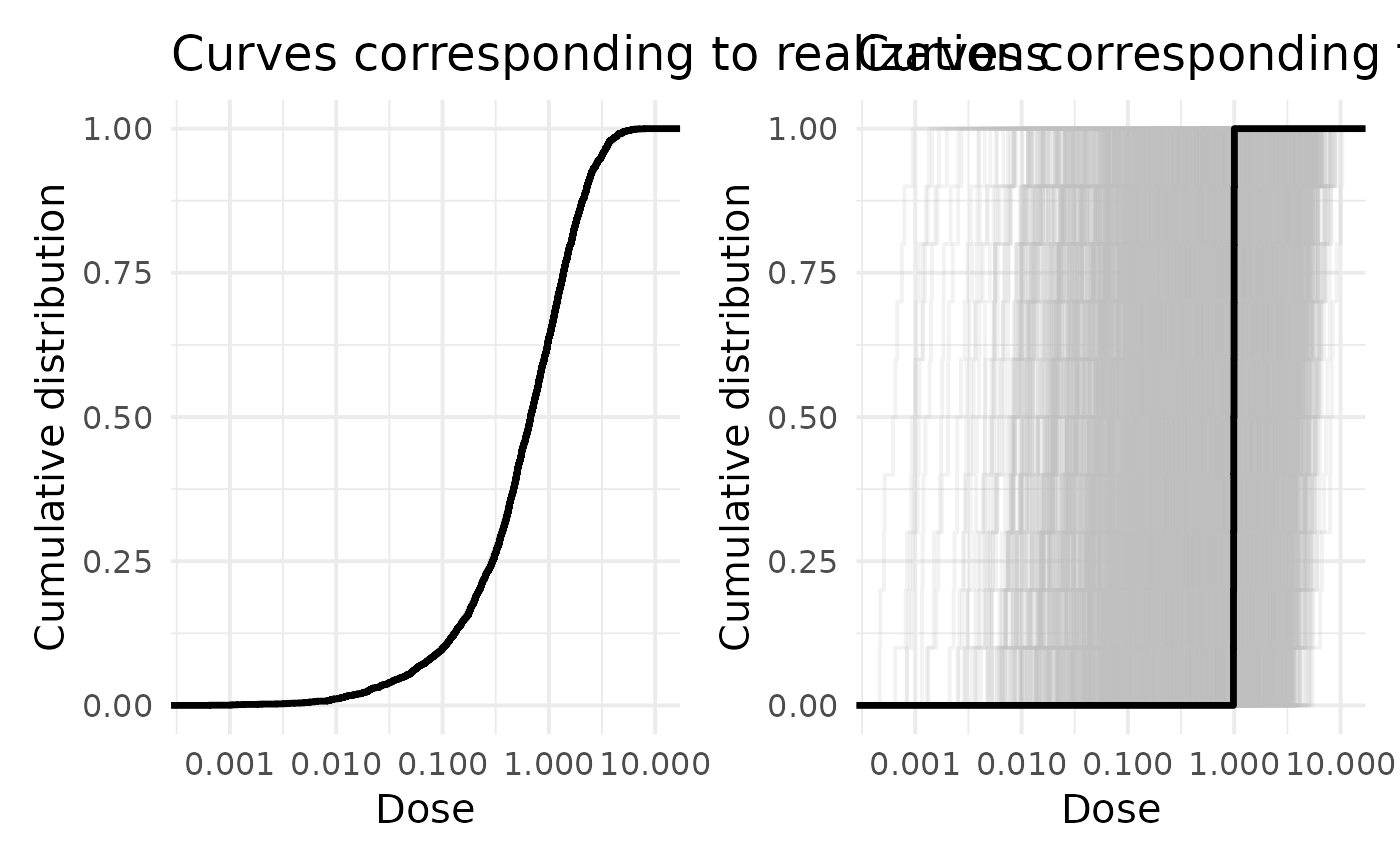
In the left panel, the empirical cumulative distribution function (ECDF) is
plotted for each dose realization. In other words, each curve shows one distribution
of dose across individuals. The spread within individual curves reflects the dose range
across individuals, while the spread between curves reflects between-realization variation
on the cohort level. If show.mean=TRUE, the solid black curve is the cumulative
distribution of the mean dose for each individual.
In the right panel, ECDFs are plotted for each individual,
showing distributions within individuals. A wide spread within individual curves
is indicative of large within-individual variation, while the spread between
curves reflects between-individual variation. If show.mean=TRUE, the solid
black curve is the cumulative distribution of the mean for each dose realization.
When using a log-scale for the x-axis, any zero dose values are excluded before plotting.
Examples
# \donttest{
if (requireNamespace("ggplot2", quietly = TRUE)) {
data(data, package="ameras")
ecdfplot(data, dosevars=paste0("V", 1:10))
}
 # }
# }